10th Avenue Tea
Agency: JB Chicago
Logo design + Packaging + Collateral
With an innovative and award-winning product and bottle design, this shakeable tea company was ready for a new look and an updated company voice. We wanted to bring the "zen" to everyday life and highlight the convenient, on-the-go packaging.
Creative branding
10th Avenue Tea provides a calming moment of serenity during the chaos of everyday life. To tell their story, we paired a spa-like color palette and organic textures with a thin-line sophisticated logo. It’s old world zen meets modern convenience..
Brand idea
For many, tea means one thing — serenity. But calm and serene doesn’t exactly line up with the chaos of a working parent’s day. In developing 10th Avenue Tea’s brand idea, we wanted to marry the convenience of their portable shaker bottle with the belief that tea brings you peace of mind wherever you happen to be. And hence, our idea was born: be in the now
Package Design
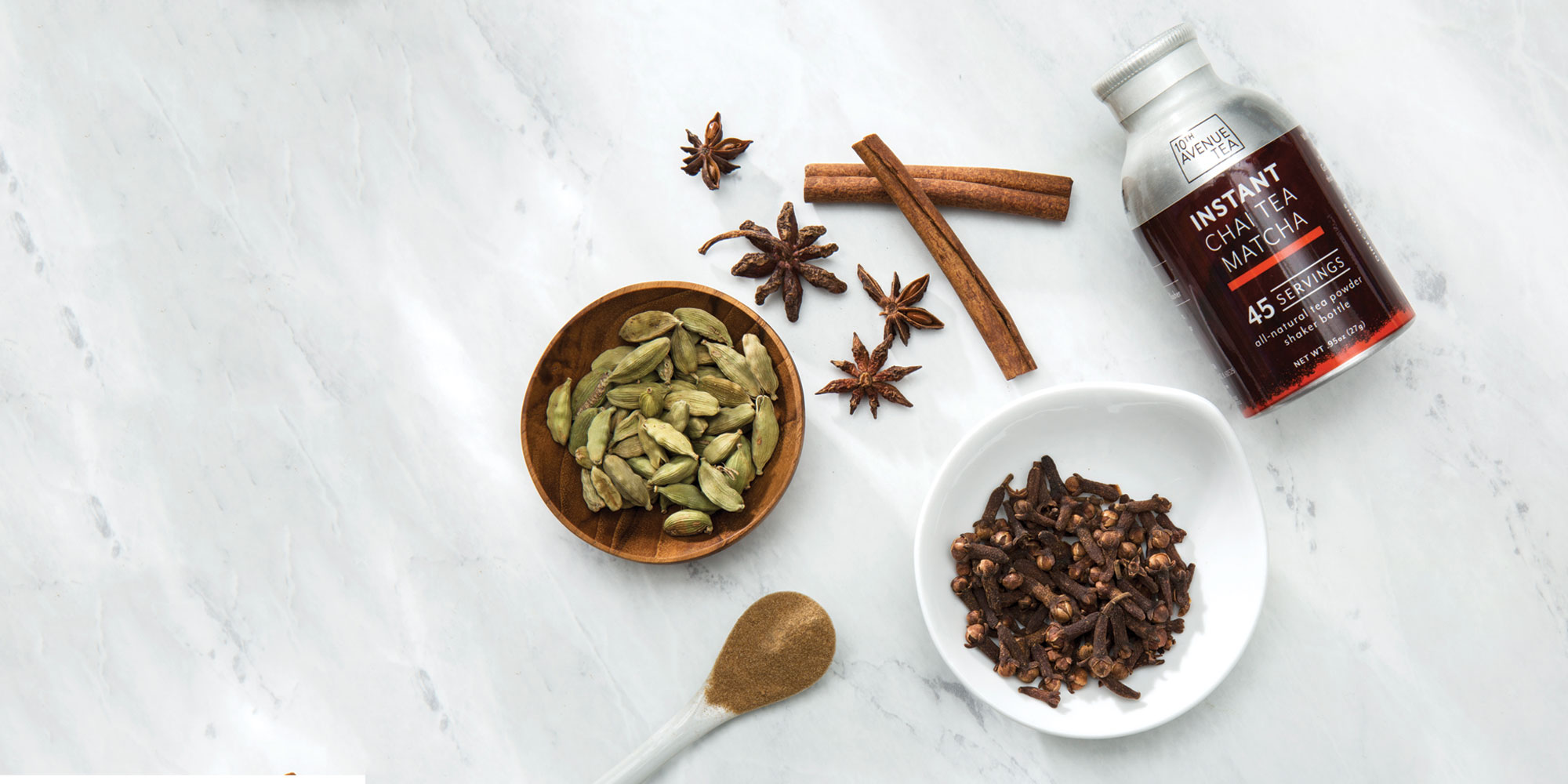
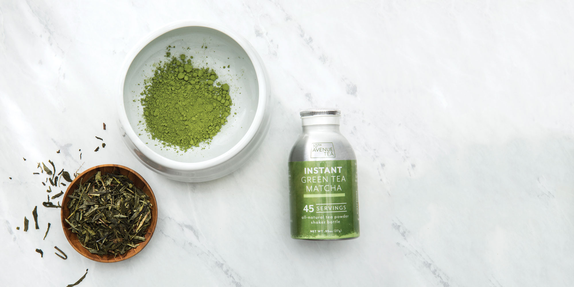
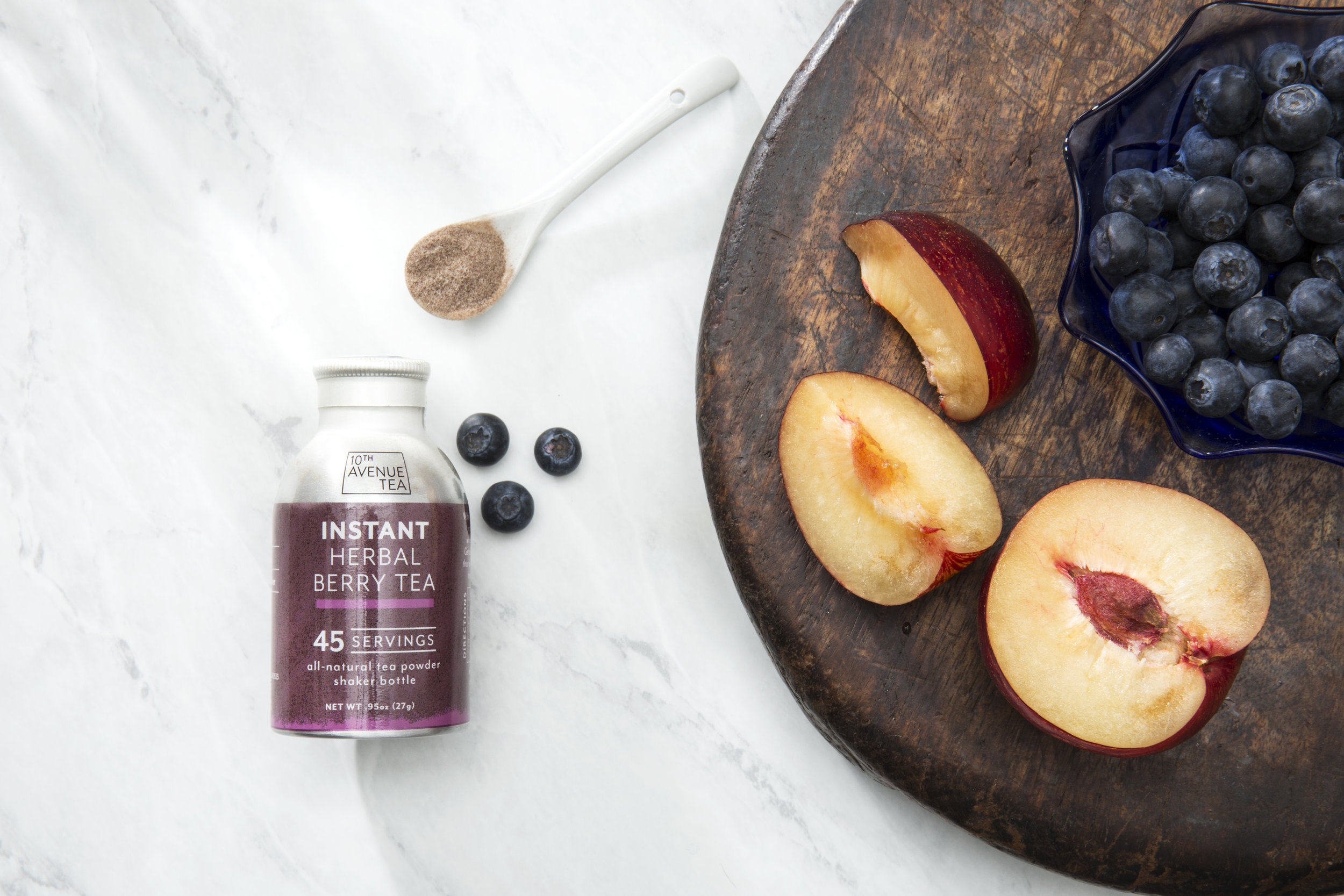
We redesigned 10th Avenue Tea’s shaker bottle labels with the hierarchy of messaging in mind. It was vital to get across the important takeaways: number of servings, ease of use, description and flavor, all on one small package. Employing stone textures and accent colors, we turned the little bottle into a savvy accessory that’s easy to take with you wherever you go. This look was carried through to the design of K-Cup packaging and boxes.
PRINT MARKETING
We brought the same clean, zen look to their sell sheet materials. By letting the natural beauty of the tea powder and tailored packaging be the heroes of the piece, the same feeling of peace and calm is achieved.


