Kite Hill
Agency: Ptarmak
Photography: Alex Crawford [Packaging]
Tracie Davis [Lifestyle]
Strategy + Brand Identity + Logo Design + Packaging System
With its deep culinary California roots, this chef-created brand has established itself as a trusted purveyor of dairy-free foods for over a decade. Products carefully crafted from loving and uncompromising R&D, Kite Hill offers dreamy, creamy foods using old world cheesemaking techniques. This is never an "alternative", it's what dairy only dreams of.
Real Food Right
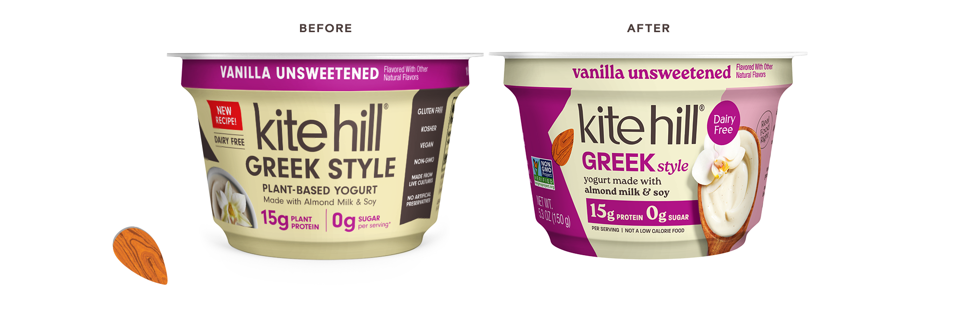
Ready for a refresh, Kite Hill identified an opportunity to reinforce its proposition and appeal to new (and existing) consumers. Building from smart strategy, we revamped the entire branding and packaging system, with a focus on increasing shoppability through clear on pack communication and delicious photography.
The primary objective of the brand refresh was to improve shoppability and break through the clutter on shelf while bringing current consumers along for the ride.
BUILDING A BRAND
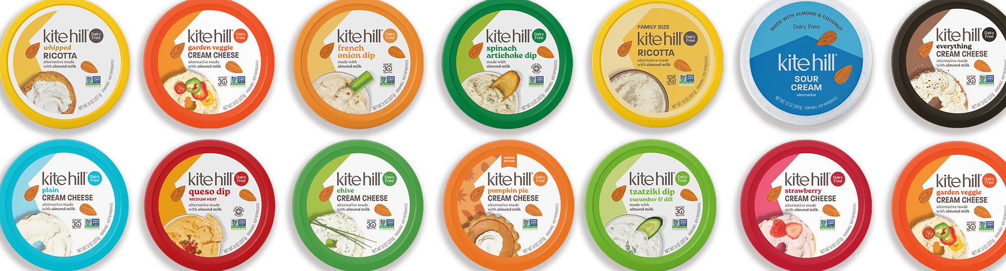
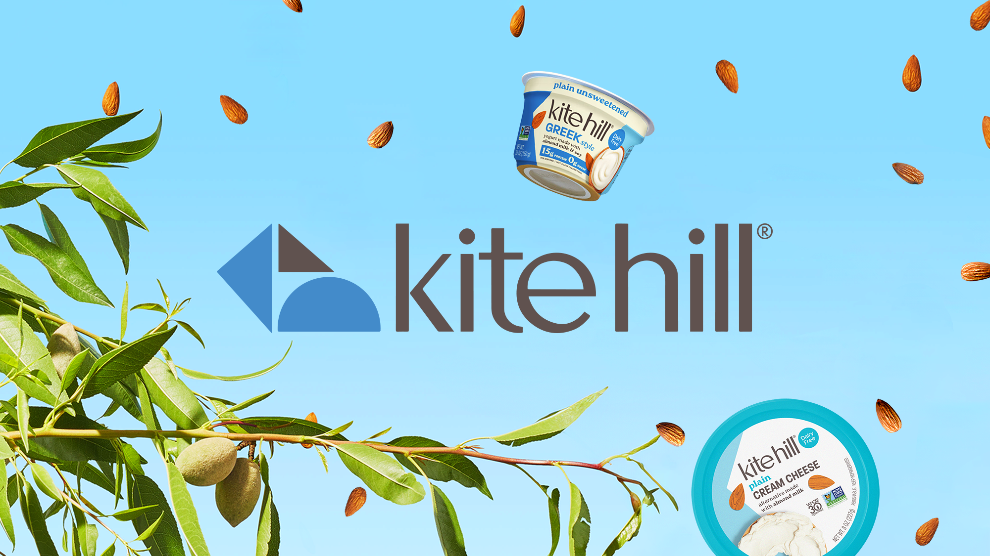
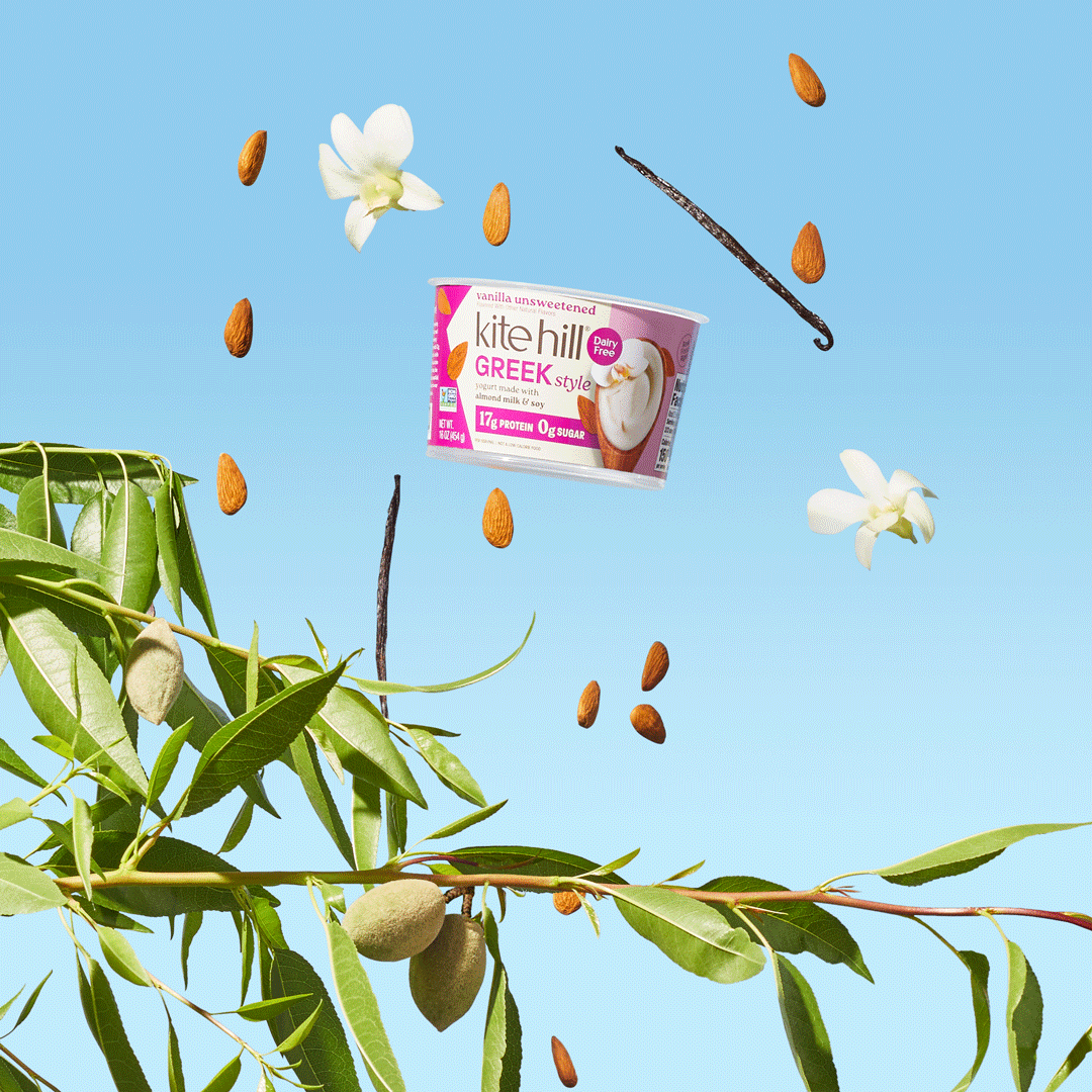
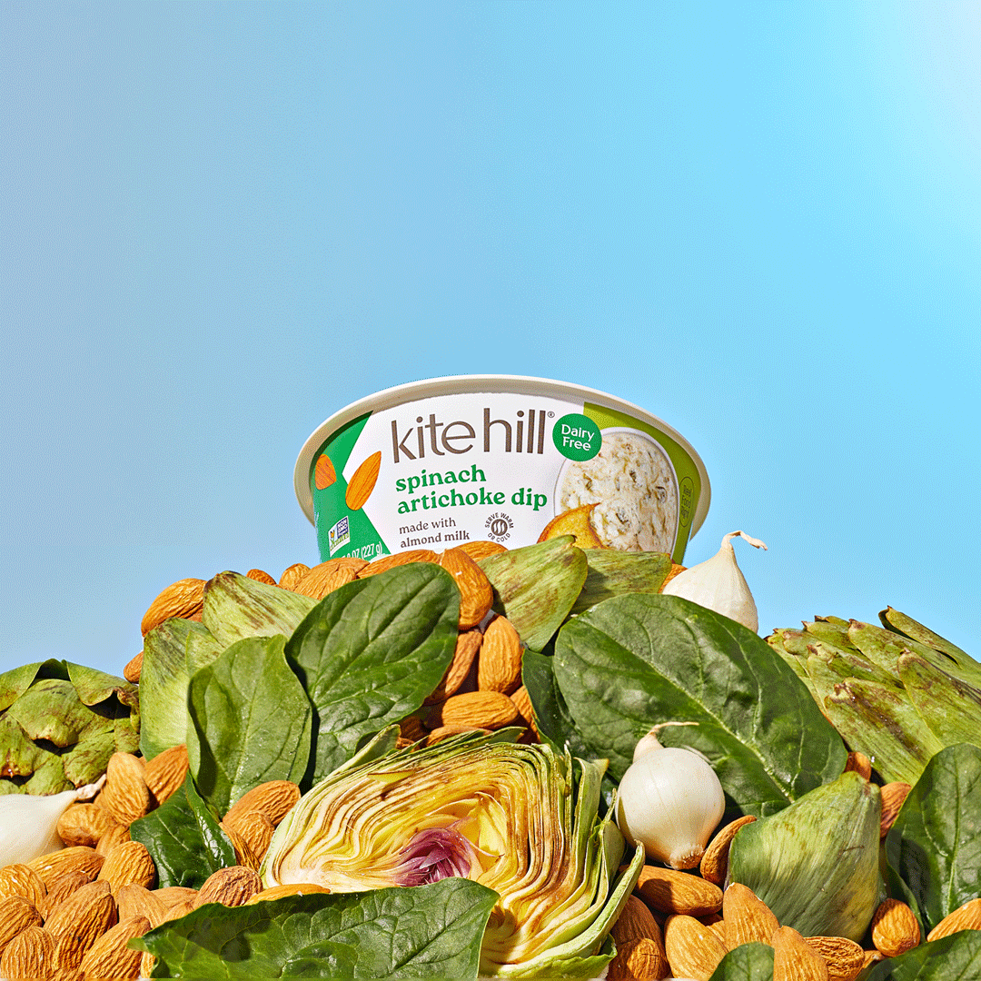
We introduced a refined (and slightly quirky) logotype and "Dairy Free" call-out across the packaging system. Prominent bespoke food photography was used to amplify taste appeal, highlighting each product's ultra creamy tastes and textures. Artful illustrations emphasized the heart of the brand across category: real California almonds.
Obsessively CrAFTED
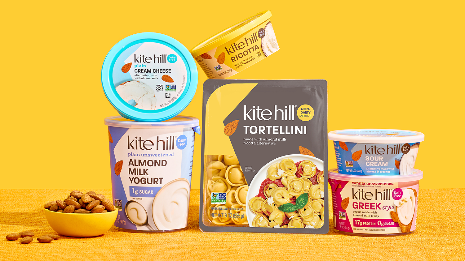
To make the best, they use the best. The new packaging elevates the almond, champions the food (with enlarged photography across the system), and de-clutters the composition for ultimate shoppability.


These vibes are *chef's kiss*. The Kite Hill world is built on minimal and purposefully styled compositions, where the products are always the hero. It incorporates a sense of dreamy weightlessness and the brand's bright, vibrant colors.
THE INGREDIENTS
The toolkit is comprised of elements that reinforce the brand - authentic tone of voice, bold, flat colors, almond-inspired textures, and playful photography that celebrate Kite Hill's dreamy non-dairy products.


Kite Hill's color palette is built from a foundation of white and brand brown. The rest of the family is a rainbow of colors pulled directly from packaging, inspired by each of the delicious sweet & savory offerings. Always bold and vibrant, the broader color palette is used primarily to add emphasis, taste and joy to the greater brand expression.